On a trip to the King Valley, which partly was to explore the valley but also to learn how to take food photos, I learned so many tips from Ewen and I feel I have improved my photography so much. You can see some more photos that I took on the trip in the posts below.
King Valley part 1
King Valley part 2
King Valley part 3
King Valley part 4
In this post, I will share some of the tips that Ewen shared with me. I've explained a lot of things in very basic language, which some of you may already know so please excuse me. For others, it may be useful to understand the theory behind things and also the terminology. In regards to the tips, they can apply to all types of photos. However, they are probably more suited to food and scenery, things that tend not to move too much. Taking photos of people is a whole different kettle of fish. The tips are in no particular order and can be used in conjunction with each other.
1. It's All About Context
Whilst I said the tips are in no particular order, this first tip is probably the most important and what Ewen kept drumming into my brain. When shooting any type of photos, you need to provide the viewer with some context. For example, if you shoot a person close up, you can't tell if they're tall or short. You take the shot again with a person standing next to a car, and you can get a rough feel of how tall or short that person is as most people know how big a car is.
Hence, for most photos, it means you want to shoot a little bit wider, so that the viewer can comprehend what they are seeing and how they can relate to it. For food in particular, this may mean showing a few other objects around a plate of food so you can get a sense of the setting. Believe me when I say that shooting a bit wider will actually draw the attention of the viewer closer into what you want to focus on. Shooting a bit wider does not mean that you just randomly snap a photo. Far from it. You still need to find what you think the focus should be in a photo, and frame your photo around that. This tip is just a general tip so of course there are still occasions where you want to shoot extremely close for some particular reason. But as a whole, context really helps to make a better photo.
In the photo below, my focus was the teapot and tea cups, which obviously are in focus. Normally I would have zoomed right in on the tea set and while it may still look quite nice, it doesn't give the same effect as this photo I feel. Here you can see that the tea set sits on a nice table and in the background you can see the beautiful Ashley having a sip of her wine. The scene is far richer in content and you gaze gets drawn around the photo, which is the aim of any good photo I believe. In this photo, my eyes are drawn from the cups to the tea pot, to Ashley, to the wine glass in her hand, to her bright hair and finally to the couch and the red walls. A very interesting photo if I say so myself haha.
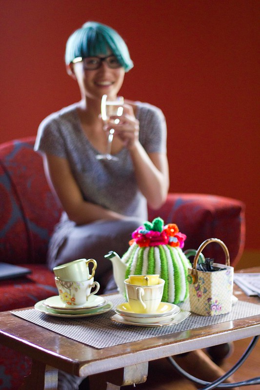
So in summary, for most photos, try to shoot a bit wider to capture more things and give some context to the item you want to pull focus onto.
2. Shoot F2 or F8
On a camera, the F-number is the ratio of the lens' focal length to the diameter of the entrance pupil. In lay-mans speak, the F-number (F-stop/focal ratio) is a measure of how much light can enter a lens. The more light that enters, the brighter a photo can be. A low F-number equates to more light enter. However, you don't get anything for free. A lower F-number may allow in more light, but it also reduces the depth of field of an image. The depth of field is the amount of space that is in focus. A large depth of field means more of the photo is in focus from the front to the back, while a low or shallow depth of field means only a small section of the photo will be in focus.
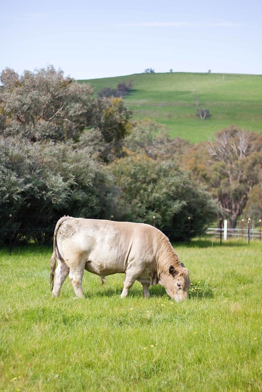
For scenery, Ewen suggests using F8 on your camera. On point and shoot cameras, you may not be able to adjust the F-number. They do usually have different modes so pick the scenery mode. That will most likely put your camera in a mode that uses a higher F-number. As a scenery photo tends to cover great distances, you want a higher F-number that will allow more of the main subject to be in focus while still blurring out some of the background or foreground to draw the viewers focus in. Below, you see the cow in focus with enough context to see that she is in a field in a beautiful mountainside.
For food photos, Ewen suggests mostly using F2 for all shots, and only switching to another F-number if you have a really good reason. He suggests that you don't gain much more with the other F-numbers unless you are going for some specific look. With F2, it gives a very low depth of field and really forces you to focus on the main object. The depth of field isn't too low like F1.4 which you have to use very carefully as you lose context generally due to the extremely low depth of field. For F2, as shown in the photo below, my intention was to guide the viewer to focus on the melting ice cream over the beautiful fluffy pancakes. You can still make out the strawberries and jug and get a sense that there's some other food in the background, which all help to give a sense of context and entice the viewer to want to eat the food. Even if you shoot from top down, F2 is still the preferred setting. It will help to keep the main object in focus and blur out any other on a different height. However, if you want everything to be in focus, choose F8.
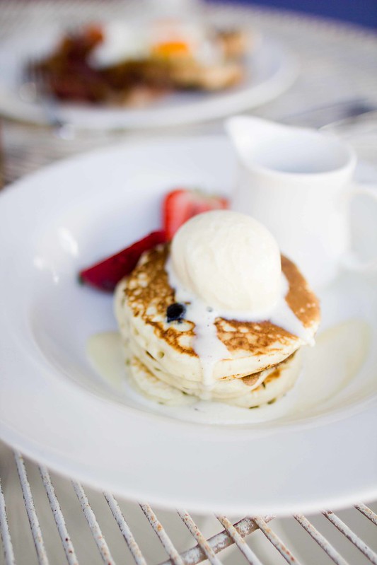
So in summary, use F8 for scenery photos and F2 for food photos most of the time. If you know what look you want, you can choose other F-numbers but make sure you know your intentions before deviating from these settings.
3. Try To Avoid Centering Photos
In general, having the subject right in the middle of the photo makes for a very boring photo. If you shoot a bit wider, you can always crop it a certain way to make sure the subject is not right in the centre. Have items to the side or even partially cut off as it creates interest and again forces the viewer to look around the photo.
You can still centre photos but make sure that's your intention and you consciously choose to centre a photo for a good reason. In the photo below, I wanted the dessert centered as I like the symmetrical look of the glass and the angular plate. The spoons are still a little off centre so provide some interest to the overall photo. If you want to shoot perfect symmetry, it's very hard to setup and you have to make sure you get it perfectly symmetrical or it will look very wrong.
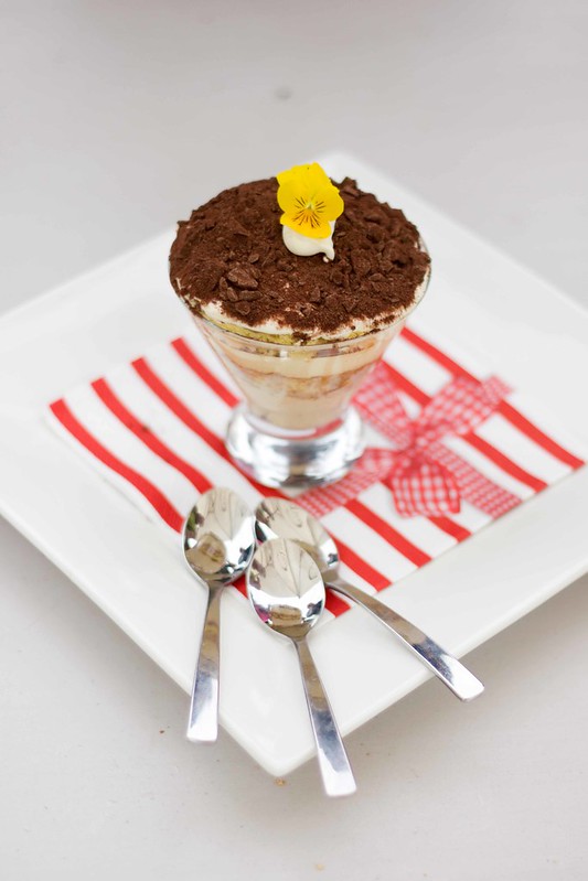
So in summary, ensure objects in photos are off centre and only centre a photo when you have a specific vision in mind.
4. Use Empty Space To Draw The Viewer In
Just like Rule 1 to provide context, using empty space also provides context to a photo, and leads the viewers gaze to the main subject. The space can be in front, to the side or behind the main subject and will all help to draw focus into the main subject. In the photo below, the beautiful table leading away from the flowers creates focus on the simple flower arrangement on the table.

So in summary, use empty space around the main subject to draw focus onto it.
5. Use Complementary Colour Palettes and Textures
Some colours and textures are really hard to make work. It's not impossible but you do need a good eye and choose the right tones of those colours. For example, I think it would be extremely hard to make a strong purple and orange colour work harmoniously. Hence when you are shooting a photo, if possible try to set it up so that colour compliment each other. In this photo, Ewen noticed that Sarah was wearing a nice brown crumpled scarf that complimented the cannoli. The colour palette in this photo works well together to give a nice comforting feel. Can you imagine if the background was a shocking bright pink or purple. I think it would be quite disjointed.
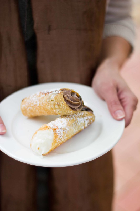
So in summary, try to choose colours and textures that compliment the colour/texture of the main subject.
6. Shoot Into Light and Create Overexposure
I've always been taught that I should shoot with the light so this tip was quite confronting for me. Ewen taught me that you can shoot into the light and have overexposed parts (get your mind out of the gutter) in a photo and it still looks great (*gasp* overexposed photos used to be my worst nightmare). When you shoot into the light, to get the foreground bright enough, it tends to mean that back where the light is really bright. Unless you want to edit the photo meticulously, there will be overexposed parts. However, you can use this to your advantage to create a glow from behind the food that really draws focus onto the food at the foreground. Below, you can see that the back part of the photo has become completely saturated but the brightness actually makes you look at the muffins and croissants at the front.
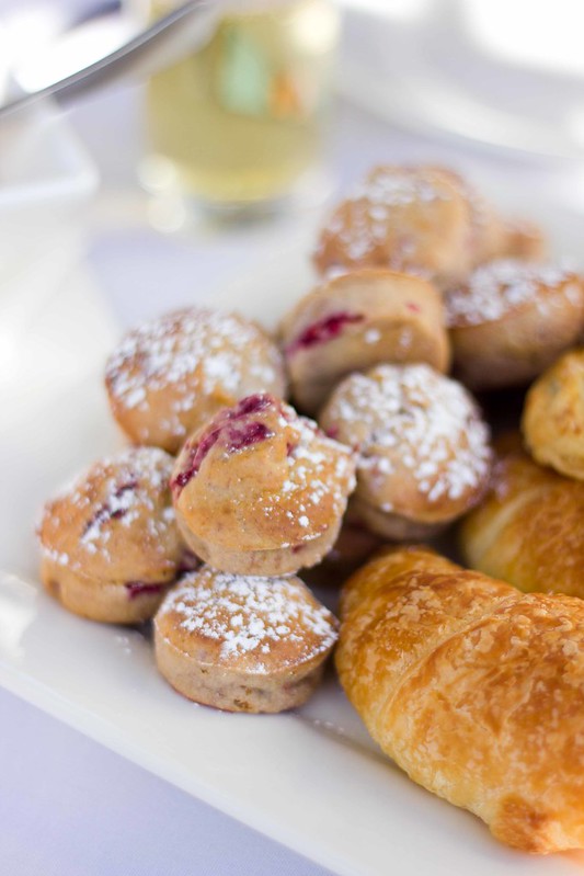
So in summary, don't be afraid to shoot into light to give a different look and overexposed parts of the photo can actually enhance it.
7. Fill Up Space To Create Interest
Of all the tips from Ewen, this one was the one I found most confronting at the beginning. I used to shooting the main food subject and not having much around it to draw the focus onto the main subject. However, as with the earlier rule, context helps to draw a viewer into a photo. Objects around the main subject help create interest and when used in conjunction with the F2 rule, the other objects are generally blurred and you get a presence of them without the items detracting from the main focus. In the photo below, you can see some other plates and food items but I believe the main focus is firmly on the wonderful beetroot salad.
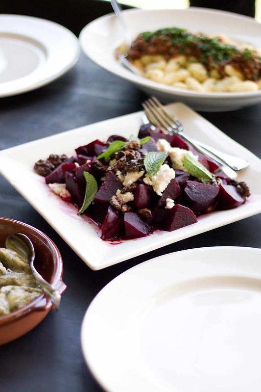
So in summary, don't be afraid to fill up the photo with other objects that create context and create more interest around the main subject.
8. Use Different Compositions and Angles To Change Focus
This tip sounds so obvious but I think few of us actually do it. Ewen suggests firstly to shoot from different angles, and second by changing the composition of a photo around to get a different look. I was thoroughly amazed how different the photos look just purely shooting from different angles, both vertically and horizontally. What I mean is to shot from higher to lower and to shoot around a subject. In the photo below, we tried shooting from different angles and I hardly recognised it was the same setup. In the end I decided this angle was my favourite as it allowed the viewer to clearly see the rocky road.
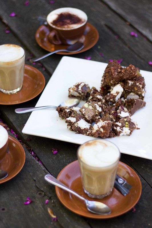
The second tip is change the composition of a photo. This can mean simply moving a few items around. The items in the photo below are exactly the same as in the photo above. However, by lining them up and shooting it the way it is, the focus is clearly on the coffees now rather than the rocky road.
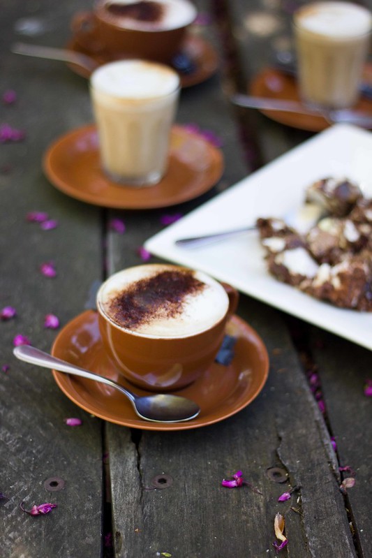
So in summary, shoot from different angles to see what provides the best focus on the main subject, and don't be afraid to move items around to change the composition and again change the focal object.
9. Use Contrast and Saturation To Create a Natural Feel
Once a photo has been shot and cropped, there is still capability to change the look and feel of a photo. Contrast and saturation are two powerful tools that can really change the feel of a photo. In general for food and scenery, Ewen suggest increasing contrast to provide more definition of the main subject, and reducing saturation to give a more natural feel due to the contrast causing an unnatural look. Those two things generally have to work together. If you increase contrast, you drop saturation. If you reduce contrast, you increase saturation. Sometimes you can break the rule but again you must have a specific vision in mind. I used to greatly increase the saturation of my food photos as I thought it made it more enticing but having tried this new method, I far prefer a high contrast/low saturation photo. It definitely feels far more real and natural. In the photo below, I increased the contrast to give more definition to the leaves and some brighter parts, and reduced saturation to give the leaves a nicer green.
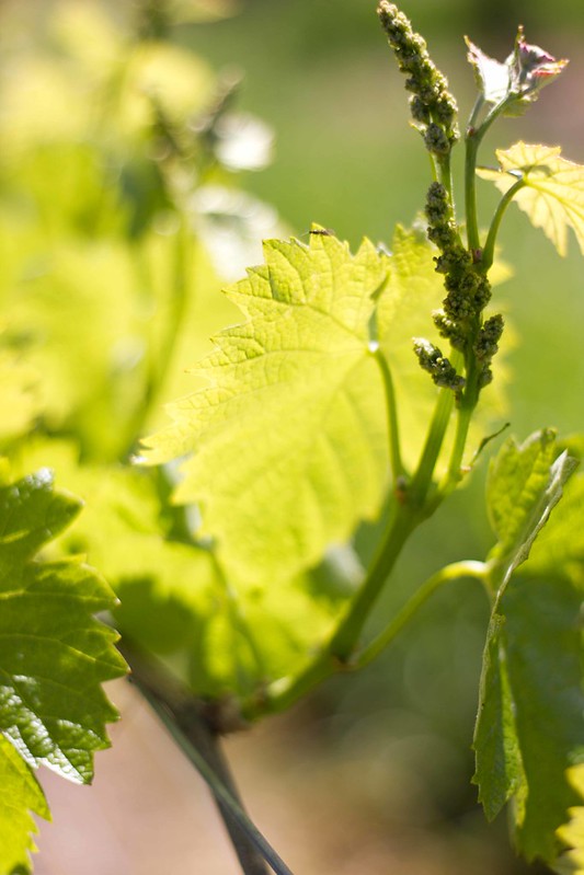
So in summary, generally increase contrast on a photo and reduce saturation to give more definition and a more natural feel.
10. Use Colour Tints and Black and White To Create Impact
Lastly, changing colour tints or even go to the absence of colour to create black and white photos really change the impact of a photo. I always thought that black and white can't work for food photos, but Ewen showed me that it can work. I'm still hesitant to use a lot of black and white for my food photos but used correctly, it can create a lot of impact. As with any other photo, it can be hard to visualise the impact of an edit, and this is especially the case for black and white. One tip is to use the black and white preview on your DSLR so you can see what the final photo may look like such that it allows you to change the composition or settings.
In the photo below, the black and white really makes the photos quite strong as the focus is on the lines of the glasses, the bubbles, and the shadows that's created. It makes what is quite a simple photos into something very interesting and really catches your eye due to the lack of colour.
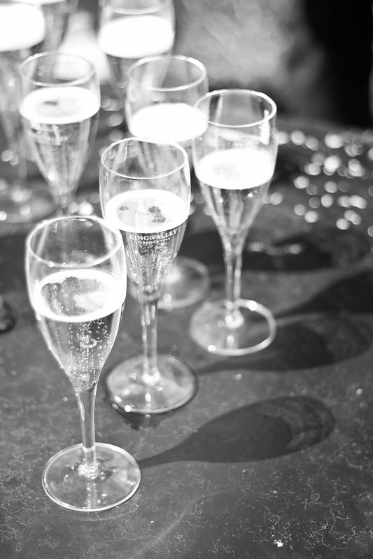
So in summary, using colour tints or black and white can create impact as it forces the viewer to look at the composition, shapes and shadow more closely due to the lack of colour.
And that concludes some tips I learned from Ewen about how to take better photos, in particular food photos. I have consciously thought about these tips and applied them to my photography and I feel my photos have improved dramatically. I am enthused about food photography again and am experimenting with lots of different setups. You can check out my experimentation on my Instagram account ieatblog. Thanks so much Ewen for giving your time and passing on all these amazing tips. It's made food photography fun for me again as I love my own photos now. (#modestmuch #selfpraise #selfbow)
I hope you've found these tips useful. They're just a start to help get you going and you can learn a lot more with your own experimentation. Also, check out Ewen's websites for even more tips and interesting articles. Soon you'll be shooting lots of great food photos and having lots of fun doing it I hope.
EDIT:
It turns out that Ewen has written up an awesome post about food photography too, so go read that as well here.
Nice post, and I'll say I've noticed your experimentations on Twitter/Instagram and saw some really pretty pictures from you this year. :)
ReplyDeleteThank you. I'm really enjoying playing around with different ways of shooting photos.
DeleteThis is a really helpful post - you've set out the information really clearly with some tips that I really need to learn from.
ReplyDeleteIf you are interested in black and white photography you should check out the Black and White Wednesday blog event that has amazing black and white food photos - I don't feel up to participating but it has made me think about black and white photography - http://cindystarblog.blogspot.it/2013/01/black-white-wednesday-rules-host-line-up.html
Thank you. I really hope it helps others.
DeleteThank you for the link, I shall check it out.
Beautifully written post Teddo :) I wouldn't mind comparison shots as well, of without the tips and with the tips. But kind of hard given you've already taken the pretty perfect ones :) Good Work!
ReplyDeleteThanks #originalmsihua I wanted to do comparison shots too but I didn't think that far ahead and already took them using the new method.
DeleteThis is such a great post, Thanh and I can tell you put in a great deal of effort in setting up your shots and it's really paid off. Such high quality in your work, even if it's everyday photos on your Instagram but you make them look unordinary. You can tell from almost all my photos that I'm guilty of failing at almost every one of your tips above. Esp the one about context or empty space. Because I have such limited space in my home that I only have a very small benchtop or table space for my food so it tends to be very zoomed in (otherwise you will see my couch, tv, etc haha). But need to find ways to get around this limitation. I enjoy the technical side of taking photos by playing with camera settings and post processing but food styling is still my weakness by far! Hopefully I get better but I must say I am a very slow learner. Thanks for all your wisdomfulous words, Sensei!
ReplyDeleteThank you. There is a bit more effort but I find it worth it when I see my own photos.
DeleteHaha it's never too late to apply some of these tips. And definitely context is key.
You can make a small area work with a simple setup. I only use about a 1m x 1m space. It's all about setting it up correctly so you can't see tvs, couches etc. Hence top down shots are useful.
I'll give you some more tips in person next time and soon you'll be a pro.
Great post. :) Does Ewen run classes by any chance?
ReplyDeleteHey Charlie :) Indeed I do. March I have a special workshop with Billy Law. It's the bomb!
Deletehttp://ewenbell.com/itinerary-food.php
Definitely worth doing one of Ewen's workshops Charlie. So informative and fun.
DeleteGreat tips! I'm always being inspired by others - and it's funny that often I find the best shot I've taken is either the very first or the very last. lol
ReplyDeleteThanks Helen. Your photos are already awesome. I find the first or last is the best too. Usually what I start with is already to my liking or I fiddle around until that last shot and I'm happy with it.
DeleteThanks so much for this piece! It's really helpful for a new food blogger and SRL user - easy to understand with great examples and you've outlined some things I han't realised before...hopefully with practice I'll be able to take great photos like the ones on this blog!
ReplyDeleteNo problems Jen. Hope it helps you. And thank you for your kind words.
DeleteVery good tips Thanh
ReplyDeleteThanks.
DeleteGreat article. Now to put it all into practice!
ReplyDeleteYep putting into practise is the hard part.
DeleteGreat tips. Go self praise, go.
ReplyDeleteGotta lose self praise.
Delete